• The site has now migrated to Xenforo 2. If you see any issues with the forum operation, please post them in the feedback thread.
  • Due to issues with external spam filters, QQ is currently unable to send any mail to Microsoft E-mail addresses. This includes any account at live.com, hotmail.com or msn.com. Signing up to the forum with one of these addresses will result in your verification E-mail never arriving. For best results, please use a different E-mail provider for your QQ address.
  • For prospective new members, a word of warning: don't use common names like Dennis, Simon, or Kenny if you decide to create an account. Spammers have used them all before you and gotten those names flagged in the anti-spam databases. Your account registration will be rejected because of it.
  • Since it has happened MULTIPLE times now, I want to be very clear about this. You do not get to abandon an account and create a new one. You do not get to pass an account to someone else and create a new one. If you do so anyway, you will be banned for creating sockpuppets.
  • Due to the actions of particularly persistent spammers and trolls, we will be banning disposable email addresses from today onward.
  • The rules regarding NSFW links have been updated. See here for details.

Styling requests

The search function is extremely hard to see on Light Responsive using mobile. I was going to post that there was no search box, after triple checking I didn't miss anything I found a white magnifying glass that blends in very well with the background.
 
The slider tag appears to be slightly broken. Using the example from the bbcode help page:

Title 1
Content 1
Content 2
Content 3
Content 4

●▯ is probably not what should be rendered at the bottom.
 
The dots render fine for me (using "dark responsive (green)"), but those slides are too wide relative to my phone screen and the entire right side plus the button gets cut off for me. I'd have to jump through some hoops to find out what that is in pixels though. (Model # is reported as "SM-G900V", if that helps.)
 
The dots render fine for me (using "dark responsive (green)"), but those slides are too wide relative to my phone screen and the entire right side plus the button gets cut off for me. I'd have to jump through some hoops to find out what that is in pixels though. (Model # is reported as "SM-G900V", if that helps.)
Here's how it looks in my Dark Responsive (Green).
sGqHZzi.png
 
Starts at option 4 for me (in UI.X Dark) but otherwise seems to function:

Sx1nuw4.png
 
Here's how it looks in my Dark Responsive (Green).
...Okay, something's fucky with your rendering there. I just don't know what.

I wonder what Unicode that box corresponds to. I wonder why it's rendering between the dots on your device, but not on mine. I wonder why the box in your text looks different on my device than it does on yours -- did you copy-paste that character somehow, or is that potentially a different character?
 
Starts at option 4 for me (in UI.X Dark) but otherwise seems to function:
That part is working as intended. The slider tag contains an option to specify the starting tab, and in the example it is set to 4.
...Okay, something's fucky with your rendering there. I just don't know what.

I wonder what Unicode that box corresponds to. I wonder why it's rendering between the dots on your device, but not on mine. I wonder why the box in your text looks different on my device than it does on yours -- did you copy-paste that character somehow, or is that potentially a different character?
The code I used to generate the slider is copy-pasted directly from the bbcode help page. The character I used in my text to describe the problem is an unrelated white rectangle I pulled out of charmap to try to explain the problem.

On the other hand, if this is something only I am seeing, I'll just fucking ignore it because it won't interfere with what I want to do with it.
Same in Blackened-Green, except the squares have question marks in them.
Oh, it's not just me then.
 
Last edited:
Okay. Element inpsector time.
Code:
<div class="advslidestabs outside_bullet">
<a class="bullet" href="#">••</a>
<a class="bullet open current" href="#">••</a>
</div>
Here is the problem, it's in the actual source code of the site.
Each bullet is followed with unicode U+0095 in the page source.
Depending on what fonts you have installed, this character will either be invisible and undetectable, or cause a square.
 
Unselected tags in theme Blackened are a bit eyestrain-inducing:

AtPcbWo.png


The selected tag looks great, but the others are both too bright (in background) and too isoluminent (bg brightness too close to fg).

Would it be possible to change the unselected tag text to black, or the unselected tag background to something darker (including but not limited to black)?

(But please don't change both text color and background color to black.) ;)
 
I got myself a new giant monitor (attached to a new computer), and the current text size of QQ has now become tiny. Can we have a Text size selector like some other sites?

gufZTZ3.png


Also, the people's names in the quote bar in Dark Green (other) is pretty hard to read. It's navy blue on dark grey.

pjBiz0Q.png


...An option to not have fixed margins in options would be nice as well. A LOT of the styles have a fixed size, and can end up having margins on each end greater than the actual post section. Which is funny in some ways, but some of the better looking Styles don't spark joy because they have all that empty space on the left and right. It's pretty much why I ended up on Dark Green (other).
 
I'm not sure exactly what it is, but the titles in "fieldset" are completely unreadable on Flexile Dark.

Example:
New-Bitmap-Image.png
 
Weird issue with 'Blackend'. When scrolling up or down (on a phone) there's a tinted shade on the top and bottom of every post (I'm pretty sure it's called motion blur). The blur on the top of posts is black and looks pretty good, but the blur on the bottom is a dark blue (which clashes horribly with the orange).
 
Weird issue with 'Blackend'. When scrolling up or down (on a phone) there's a tinted shade on the top and bottom of every post (I'm pretty sure it's called motion blur). The blur on the top of posts is black and looks pretty good, but the blur on the bottom is a dark blue (which clashes horribly with the orange).
Are you sure that's QQ and not your monitor? Because I'm not even sure that's possible to do with CSS.
 
Are you sure that's QQ and not your monitor? Because I'm not even sure that's possible to do with CSS.
I'm on a phone, and now they're both purple. Just something I'm going to have to deal with I guess, since it isn't happening on my other phone. I just thought it was weird since it looked so deliberate.

Edit: screen capture confirms it, It happens while the recording is playing but it's gone if I pause. Just a stupid thing that my phone does I guess.
 
Last edited:
I'm on a phone, and now they're both purple. Just something I'm going to have to deal with I guess, since it isn't happening on my other phone. I just thought it was weird since it looked so deliberate.
It looks to me like there's a missing element which would have been drawn under the text, and over that part of the box line.

Then the text would look like a caption, seeing as it's vertically centered on the top box border.

kPT5mmp.png
 
Just a suggestion. What do you think about adding an invisible spacer to the threadmark navigation buttons for the last threadmarked chapter?

Reason why I ask, occasionally I'll quickly click through chapters and when it hits the end, it opens the threadmark list. A minor annoyance, but still and annoyance. Similar minor annoyance when you want to start from the last chapter and start clicking backwards, after the first click you have to reposition your mouse.

Before
F2CqUtM.png


After
xxQnzNa.png
 
In style Blackened-Green, the [article] tag uses an off-white background colour while retaining the same light-gray default text colour as is used on normal posts with their dark-gray background. This results in low contrast which makes the text difficult to read:
Article:
Light text on lighter background.


Edit: Also, the little '<legend>Article:</legend>' tab which is supposed to display the article name isn't tall enough to display correctly; all you can see is the bottom half of the word 'Article'.
 
In style Blackened-Green, the [article] tag uses an off-white background colour while retaining the same light-gray default text colour as is used on normal posts with their dark-gray background. This results in low contrast which makes the text difficult to read:
Article:
Light text on lighter background.
Also terrible on UI.X Dark theme:

DfUA5cS.png
 
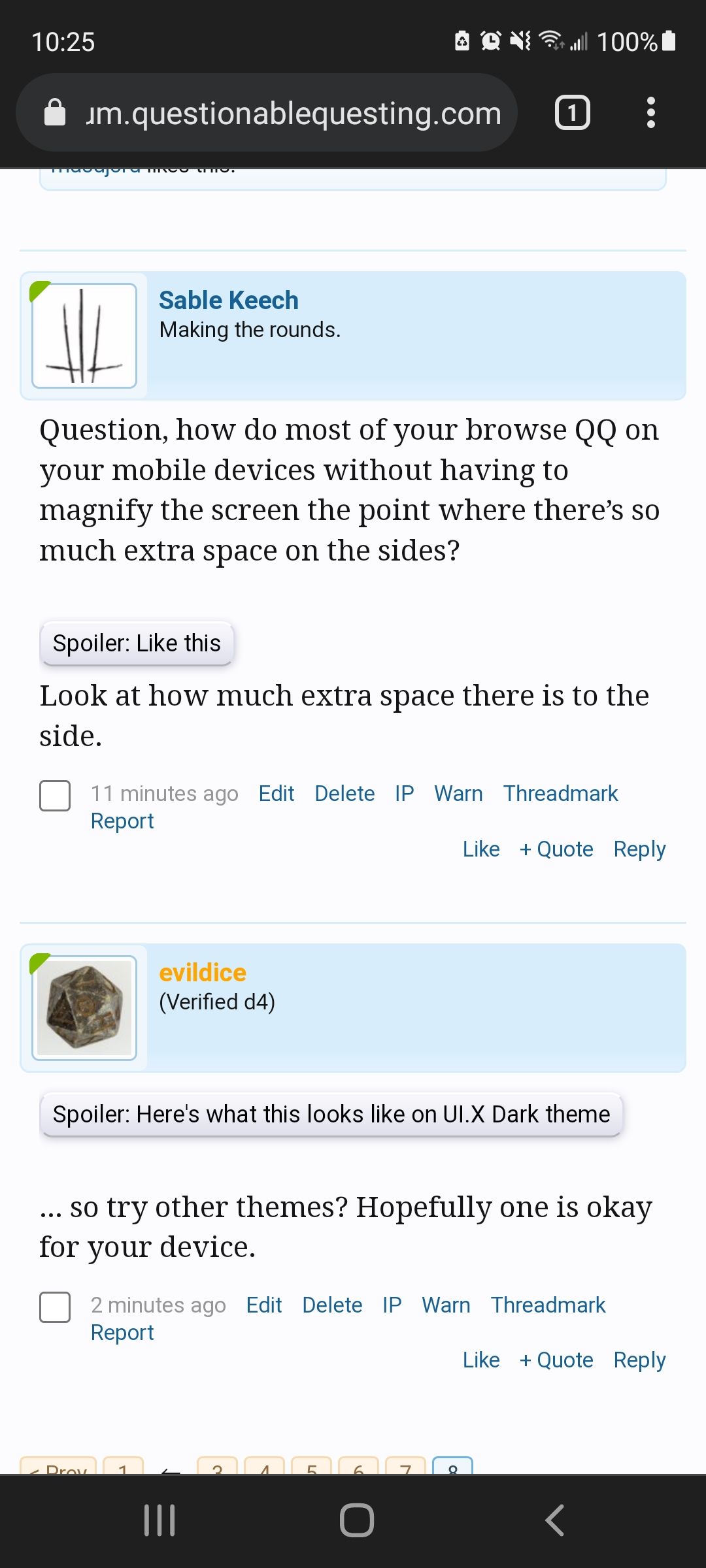
Question, how do most of your browse QQ on your mobile devices without having to magnify the screen the point where there's so much extra space on the sides?

TyKNguf.png
Look at how much extra space there is to the side.
 
pFI8114.png

... so try other themes? Hopefully one is okay for your device.
 
In Blackened-Green, the preview generated by the post editor isn't styled quite the same as the actual posts. The default text colour in the preview is RGB (200, 200, 200), whereas when you actually post its RGB (151, 151, 151).
 
What is the BBcode for the highlight or background, whatever the hell it's called. The button on mobile next to the text color changer that does this.

Edit: it doesn't work, I am confused.
 
Does the engine recognize Zero-Width Spaces as legitimate places to line break Topic Titles?
I tired to use ZWS to make it easier to break relevant tags attached to my topic, instead of full-sized spaces which made it a bit ugly, but I hadn't seen any effect.

I wanted to use ZWS here, in the text between brackets:
Outsource Administration (Worm|OP|Male!OC\semi-SI)

Instead of normal spaces:
Outsource Administration (Worm | OP | Male!OC\semi-SI)

To show this (in Alerts, for example):
Outsource Administration (Worm|
OP|Male!OC\semi-SI)

Instead of this:
Outsource Administration (Worm |
OP | Male!OC\semi-SI)

Yes, it's a stupid minor inconsequential detail, but still ^_^
 
I don't think it recognizes it
Does the engine recognize Zero-Width Spaces as legitimate places to line break Topic Titles?
I tired to use ZWS to make it easier to break relevant tags attached to my topic, instead of full-sized spaces which made it a bit ugly, but I hadn't seen any effect.

I wanted to use ZWS here, in the text between brackets:
Outsource Administration (Worm|OP|Male!OC\semi-SI)

Instead of normal spaces:
Outsource Administration (Worm | OP | Male!OC\semi-SI)

To show this (in Alerts, for example):
Outsource Administration (Worm|
OP|Male!OC\semi-SI)

Instead of this:
Outsource Administration (Worm |
OP | Male!OC\semi-SI)

Yes, it's a stupid minor inconsequential detail, but still ^_^
 

Users who are viewing this thread

Back
Top